2025
Brand Guide
Redefining Hospitality with Seamless, Contactless Guest Experiences
Our Values
Innovation.
We harness technology to create smarter, simpler ways for properties to connect with their guests, setting a new standard for modern hospitality.
Simplicity.
Our solutions are designed to remove friction, making every interaction—from check-in to check-out—seamless and stress-free.
Customer-Centricity.
Everything we build is crafted to enhance the guest journey, ensuring satisfaction and convenience at every step.
Efficiency.
By automating key processes, we help properties save time, cut costs, and focus on delivering exceptional service.
The core of our brand
Our Logo Suite
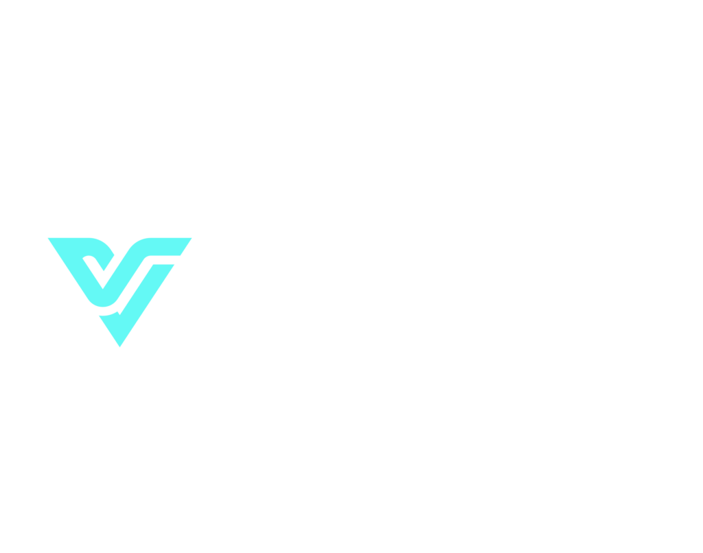
Primary Logo
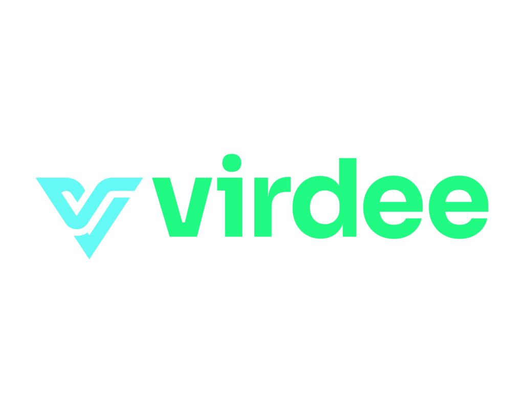
Our logo is clean, modern, and designed to make a strong presence. Its bold, geometric design reflects our's focus on innovation and precision, perfectly aligning with our cutting-edge solutions for the hospitality industry. The emblem, a stylized V, adds a dynamic touch with its sharp angles and flowing lines, symbolizing movement, efficiency, and progress.
Our Primary Logo is to be used on all official collateral. Use the Vertical or Horizontal orientation depending on placement.
Primary Logo Horizontal Teal
Primary Logo Horizontal Bright Green
Primary Logo Horizontal White
Primary Logo Horizontal Purple
Primary Logo Horizontal Blue
Primary Logo Vertical Teal
Primary Logo Vertical Green
Primary Logo Vertical White
Primary Logo Vertical Purple
Primary Logo Vertical Blue
our logo
Usage
Safe Space
When displaying the primary and secondary logo versions, maintain ample space around it to avoid crowding or interference from other elements. To achieve this, don’t place anything within the “safe space” equivalent to the height of the iconmark "V."
*Of course, there are exceptions: subtle patterns or textures overlapping at 20% opacity or less are acceptable, as well as instances where the logo becomes part of the design itself.
Please Don't
Use unapproved color combinations or colors
Distort the logo and elements
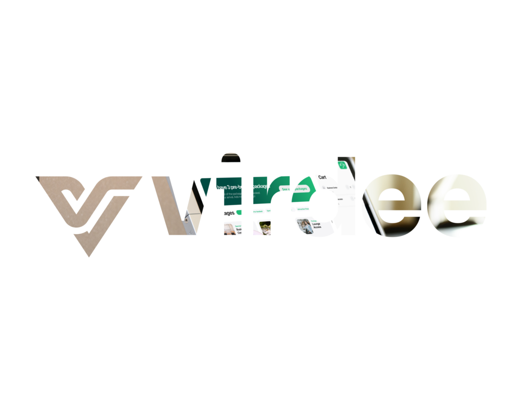
Mask images into the logo
Place on backgrounds that make elements hard to read
Use alt fonts
Virdee in
Color
Primary Colors
Black
- Hex #111B1E
- RGB 17, 27, 30
- CMYK 81, 67, 64, 75
- Pantone Black 6C
Navy Blue
- Hex #012537
- RGB 1, 37, 55
- CMYK 97, 73, 52, 59
- Pantone 539 C
Deep Purple
- Hex #724CF9
- RGB 114, 76, 249
- CMYK 69, 72, 0, 0
- Pantone 2655 C
Bright Green
- Hex #20FA83
- RGB 32, 250, 131
- CMYK 76, 0, 91, 0
- Pantone 7479 C
Secondary Colors
These secondary colors are only to be used to differentiate key elements across digital and print applications.
Light Green
- Hex #2C8C93
- RGB 44, 140, 147
- CMYK 88, 24, 42, 2
- Pantone 2236 C
Bright Teal
- Hex #64F9F5
- RGB 100, 249, 245
- CMYK 57, 0, 17, 0
- Pantone 310 C
Grey
- Hex #E4E2DF
- RGB 228, 226, 223
- CMYK 9, 8, 9, 0
- Pantone WARM GRAY 1C
White
- Hex #FEFEFE
- RGB 254, 254, 254
- CMYK 0, 0, 0, 0
typography
Our Font Families
Eyebrow/Subheadings - Sora Bold
Aa Bb Cc Dd Ee Ff Gg Hh Ii Jj Kk Ll Mm Nn Oo Pp Qq Rr Ss Tt Uu Vv Ww Xx Yy Zz
1234567890!@#$%^&
Headings - Sora Bold
Aa Bb Cc Dd Ee Ff Gg Hh Ii Jj Kk Ll Mm Nn Oo Pp Qq Rr Ss Tt Uu Vv Ww Xx Yy Zz
1234567890!@#$%^&
Body - Figtree Regular
Aa Bb Cc Dd Ee Ff Gg Hh Ii Jj Kk Ll Mm Nn Oo Pp
Qq Rr Ss Tt Uu Vv Ww Xx Yy Zz 1234567890!@#$%^&
Design Elements
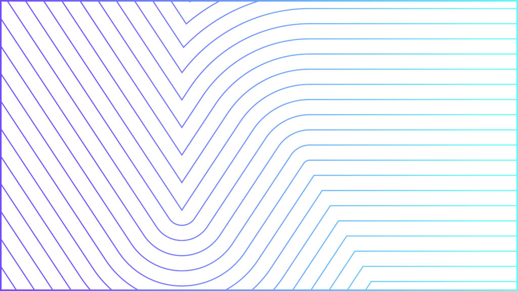
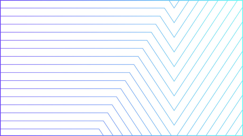
Pattern
Our pattern features angular, repeating "V" shapes that reflect the brand’s focus on innovation, connectivity, and progress. The clean lines and bright aqua tones add energy and depth, while the symmetry conveys balance and precision.
It is to be used only in the following approved colorways. Only use the pattern as an accent with marketing materials & for background purposes.
Pattern 1 Light

Pattern 2 Light
Pattern 3 Light

Pattern 4 Dark

Pattern 5 Dark

Pattern 6 Dark

Gradient
Our Gradient patterns utilizes our colorways to create beautiful backgrounds and assets for marketing tools or web.

Gradient 2

Gradient 3

Gradient 4

Gradient 5

Gradient 6

Gradient 7
brand in action
Application